Blogs
Accessibility Tip #4: Conscientious Colors
By Paul Dagnall
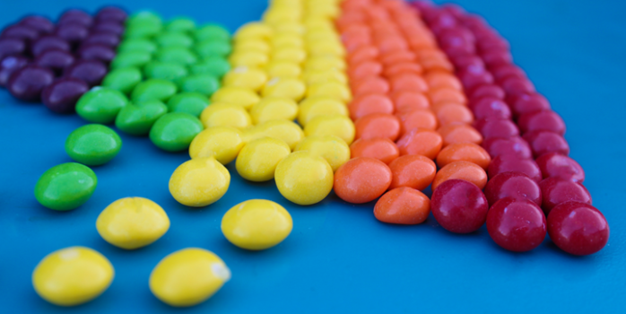
Justin, my college roommate, was very proud of a poem he had written for an English assignment, and with a flourish, he handed it to me to read. The poem was not as good as he thought; however, the topic was one of our favorite dorm activities, table tennis (ping pong). Unfortunately, the entire poem was centered around a repeating theme that identified the color of the ping pong table as gray. Seriously, the whole poem went on and on about this gray table.
The table was green.
Justin had deuteranopia, a type of color blindness that causes individuals to struggle to detect the color green.
I suspect his English professor did not deduct any points for the color issue, but all university instructors really should know how to make the colors in their content accessible by considering the following three factors:
- Color Blindness
- Contrast
- Color as Indicator
Color Blindness
Was Justin a rarity? You might be surprised to learn that one of every twenty people has some type of colorblindness, and though we want you to take all our accessibility tips seriously, this is one you absolutely cannot ignore. It’s possible you may never have a student that is blind or deaf, but you will FOR SURE have a student with color blindness in your class.
There are cases where it’s necessary to rely exclusively on color to identify something, but that is uncommon. You do not need to avoid color. Instead, ensure it’s labeled or differentiated in such a way that color identification isn’t essential.
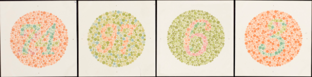 The image above contains numbers within colored circles. If you are unable to identify the numbers, you likely have some form of color blindness.
Contrast
Color contrast deals with the characteristics of colors to stand out from one another. For example, if this sentence was typed using yellow text, your eyes would be strained before you made it to this period. We see contrast issues fairly commonly here at UD, most often in slide decks.
What are the rules? Can you put green on blue? What about pink on yellow? It’s actually not quite as simple as color combinations, but fear not! Here is a handy tool for you to use so that you can verify that colors have sufficient contrast:
- WebAIM - Contrast Checker
This checker tool will allow you to put colored text on a colored background, and it will tell you if it’s ok or not.
 The images shown above illustrate how desired colors may need to be tweaked for contrast even if they are UD colors!
Color as Indicator
People with severe visual disabilities can’t see color at all. In my article about Alt text, I shared steps you can take to make your visuals accessible to those unable to see, so please always keep that in mind.
Considering color as an indicator means you should avoid using color to identify or enhance the meaning of something. For example, you might want to tell your students that the orange column contains the essential information, or you might try to communicate emphasis by making certain text red. Rather than doing this, try to use labels or bold and italic typefaces.
Consider how the following two charts would be interpreted by someone unable to differentiate color.
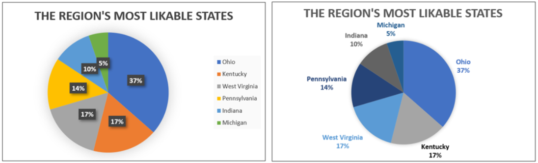
Pie charts aren’t usually the best option in terms of accessibility. The first pie chart shown would be indecipherable for someone unable to differentiate between colors. The second chart is much better because each region is labeled.
This blog post isn’t meant to give you all the answers, but rather to clue you in on some things to think about. If you have any materials you would like for the staff at the Center for Online Learning to check and make accessibility recommendations, please do not hesitate to contact us at onlinelearning@udayton.edu.
Please check out the other posts in our accessibility tips series: