Blogs

Accessibility Tip #2: Writing Good Alt Text
By Paul Dagnall
This is the second post in our Accessibility Tip series. If you missed the first tip about meaningful link text, I suggest you go review it because that tip is even easier to implement than what we are talking about in this post - alt text on images.
What is alt text?
This post is all about alternative text or alt text. Alt text is a short written description or purpose of a digital image in a website or digital document. You have probably encountered alt text yourself (or perhaps a lack of alt text!) as alt text is what displays whenever a digital image fails to load, such as in the example of a broken image with alt text in the right-most box below:
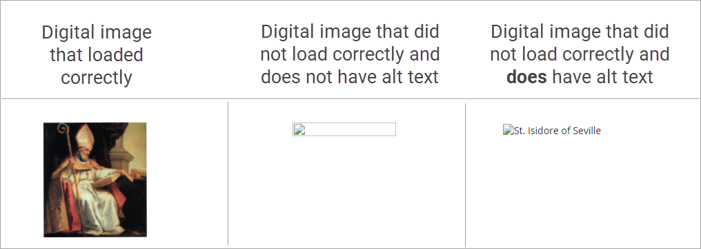
If this image did not have alt text and failed to load, you would simply see the broken image as shown in the center box above. If the image was loading correctly, sighted users would be able tell that it's a picture of St. Isidore of Seville (well, depending on the user's knowledge of somewhat obscure Catholic saints). A person who is blind, however, would have no way of knowing what the image is. The alt text that is displayed in the rightmost box is how a person who is blind understands what the image is. This is possible thanks to screen reading software. If alt text is not provided, a user who is reliant on screenreading software will be disadvantaged.
Why should you care about this?
The point of the Accessibility Tip series is to help instructors understand what web accessibility means, who it is for, and how to practically (and quickly) adopt some accessible practices into their online course design. As a component of Universal Design for Learning (UDL), making your digital content accessible improves learning for all students - but it is especially critical for students with disabilities. As instructors at UD, we are committed to equitable and inclusive content for students and other people with disabilities. Each year, we have a number of students who are blind or visually impaired.
Additionally, many universities have been sued for failings related to accessible content. It is your responsibility to make sure your content is accessible.
How do you add alt text to images?
Below are resources demonstrating how to add alt text to images in the most commonly used software platforms:
- Adding alt text in Isidore
- Adding alt text in Microsoft Office: Word, Powerpoint, etc
- Adding alt text in Google Docs
But, the step-by-step instructions of adding alt text actually isn't the tricky part. Once you learn the steps for adding alt text, it can actually become somewhat second nature to just always add alt text. The tricky part is determining the correct alt text to write!
How do you write good alt text?
Deciding on what and how much to type for the alt text is both art and science. When providing instructional materials, it is critical to communicate clearly without creating distraction. Alt text should be succinct, purposeful, and almost always depends on the context surrounding the image.
Let’s take a look at a few examples.
Example 1: BASIC Image Alt Text
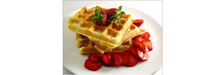
In this example, the alt text is simply “waffles”. With no additional context surrounding this picture, this is simply a decorative image that serves no other purpose than to just add visual difference to a webpage. Extra information about strawberries and a white plate are not important IF the reason for the photo is to show waffles.
Some experts say it is acceptable to not include alt text if the image is purely decorative or if the image’s description is not needed due to the accompanying text. We disagree with this. If at least minimal alt text is provided on decorative images, a student who is visually impaired can now feel confident that they were not missing something important within that image.
Now, if this image was included as part of a food review blog or perhaps on an online menu, the alt text would change to reflect more detail about these specific waffles:
Alt text: Three stacked waffles with sliced strawberries arranged on top and alongside.
Again, the idea is to be succinct and only describe purposeful details based on the context in which the image is used.
How do you write alt text for complex images?
Writing alt text gets even more complicated when it comes to complex images, such as math symbols, charts and graphs, maps, art, and more. While this blog post won't cover every situation, these are some tips to help you get started when considering the best approach for alt text on more complicated images.
Math Symbols
Math symbols are notoriously difficult to digitize and can be awkward for screen readers. The Isidore formula editor does actually make your equations accessible, though. The editor within Isidore uses a language called MathType which actually converts your equations into images and automatically supplies the alt text for each symbol. Thus, a screen reader will read the notation similar to how you would read it out loud, but it can be challenging to follow for students who are visually impaired.
Example 2: ALT TEXT FOR MATH FORMULAS
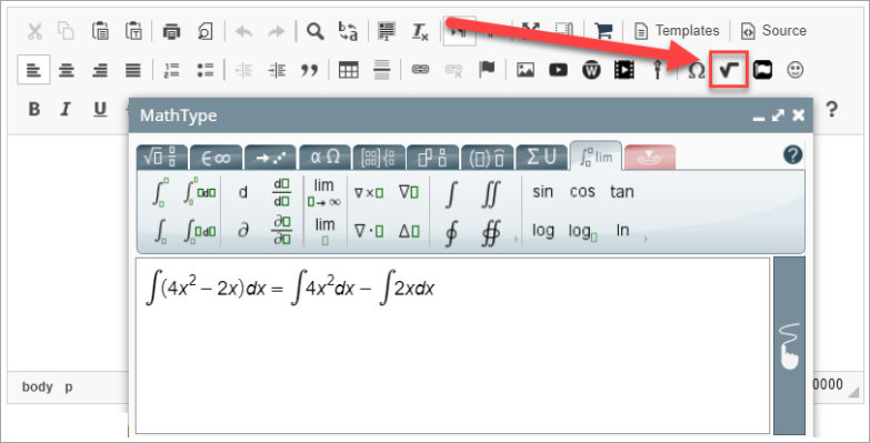
Hear how screenreading software reads out a formula like this to a person who uses this software:
Not great, right? This was a relatively easy one, too! Be aware of this difficulty and ask if an alternative format would suit your students better. The Office of Learning Resources can help your student translate mathematical equations into Braille or other formats that can assist the student with learning the content.
Bonus: Here's a fascinating interview with an instructor at the Texas School for Blind and Visually Impaired about how the technology used to teach math to these students have changed from the 70s until now. Technology has advanced the ease of learning a lot, but sometimes basic tools made from pushpins and rubber bands can help convey geometry and shapes to students who have trouble seeing.
Charts
Charts and infographics often have a huge amount of information that can be challenging to write meaningful alt text for -- especially when many websites and software programs have character limits on the alt text!
Example 2: ALT TEXT FOR CHARTS AND INFOGRAPHICS
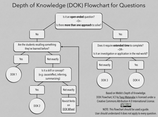
Accessible Link: Depth of Knowledge Flowchart for Questions
Even as a sighted user, this chart is difficult to read! This is another example of how making something accessible actually improves the experience for everyone in your class, not just those who rely on alt text. And, how can you write concise alt text that conveys the meaning of this flowchart?
This is a case where alt text alone is not going to be up to the task. We suggest you enter something like this as the alt text: “Depth of Knowledge (DOK) Flowchart for Questions. Explanation in accompanying link.”
Then provide: Depth of Knowledge (DOK) Flowchart for Questions, which links to a page where flowchart is explained. Links are easily found with screen readers. Take a look at the linked document to see how the flowchart was translated into an accessible format.
The WGB Educational Foundation provides Guides for Effective Practices for Description of Science Content. These guides address the most common types of complex charts and other visual representations of information.
Art
As we mentioned in the first example, there usually is no need to go into excessive detail, but there are times where the details of the picture may be important based on the context, such as including an artistic piece to enhance the meaning of your content.
Example 4: Alt text for art

Accessible Link: Time Transfixed by Rene Magritte
Within the accessible link, you'll find the following description of this image:
"This painting shows a fireplace whose interior back wall is closed; however, a toy-sized early 20th century steam engine is emerging from the closed back wall with steam trailing from the smokestack as if it were moving at speed.
The fireplace mantel has a mirror above it and golden candlesticks atop the left and right sides, and a clock is centered between them. The room has a wooden floor. To the right of the fireplace a small section of the wall is visible, which shows molded wood paneling for the bottom third."
To be clear, this amount of alt text is only necessary if there's something important about the description of the image for the learning content. If the image is meant to be purely decorative, it is sufficient to simply write the following alt text: "Painting: Time Transfixed by Rene Magritte."
So the lesson here is: Never write a book in the alt text. If it’s necessary to provide a long paragraph or more to explain the image, type it in a separate linked document similar to Examples 3 and 4 above.
We fully acknowledge that it is no small task to type out these detailed descriptions. In the last section, we’ll talk about how you can get some help in this area.
Keys for Success with Alt Text
As noted at the beginning of the article, the best way to become accustomed to writing alt text is to actually start doing it. Before long, it really can become second nature. We recommend starting by adding alt text to images in Isidore since the workflow for doing so is slightly easier than in word processing or presentation programs.
Here are some other tips to help you on your journey to alt text:
- Know that it is your responsibility to supply accessible materials.
- Provide alt text on all images in all online content or documents.
- Describe what is important based on the context. Excessive details are usually not necessary.
- Be clear and concise. Avoid going over 2 or 3 sentences.
- If the image is complicated, use the alt text to direct them to a document that describes the image.
- Reach out to eLearning or OLR if you need assistance.
How to Get Help
If you are concerned about making your materials accessible or just need a little guidance, please reach out to the Office of eLearning. In some cases we will refer you to the Office of Learning Resources (OLR) if additional assistance is needed. There have been cases when OLR has responded to student needs to acquire alternative formats such as braille and tactile models.
We hope this guide helps clarify the process for providing alt text on images!